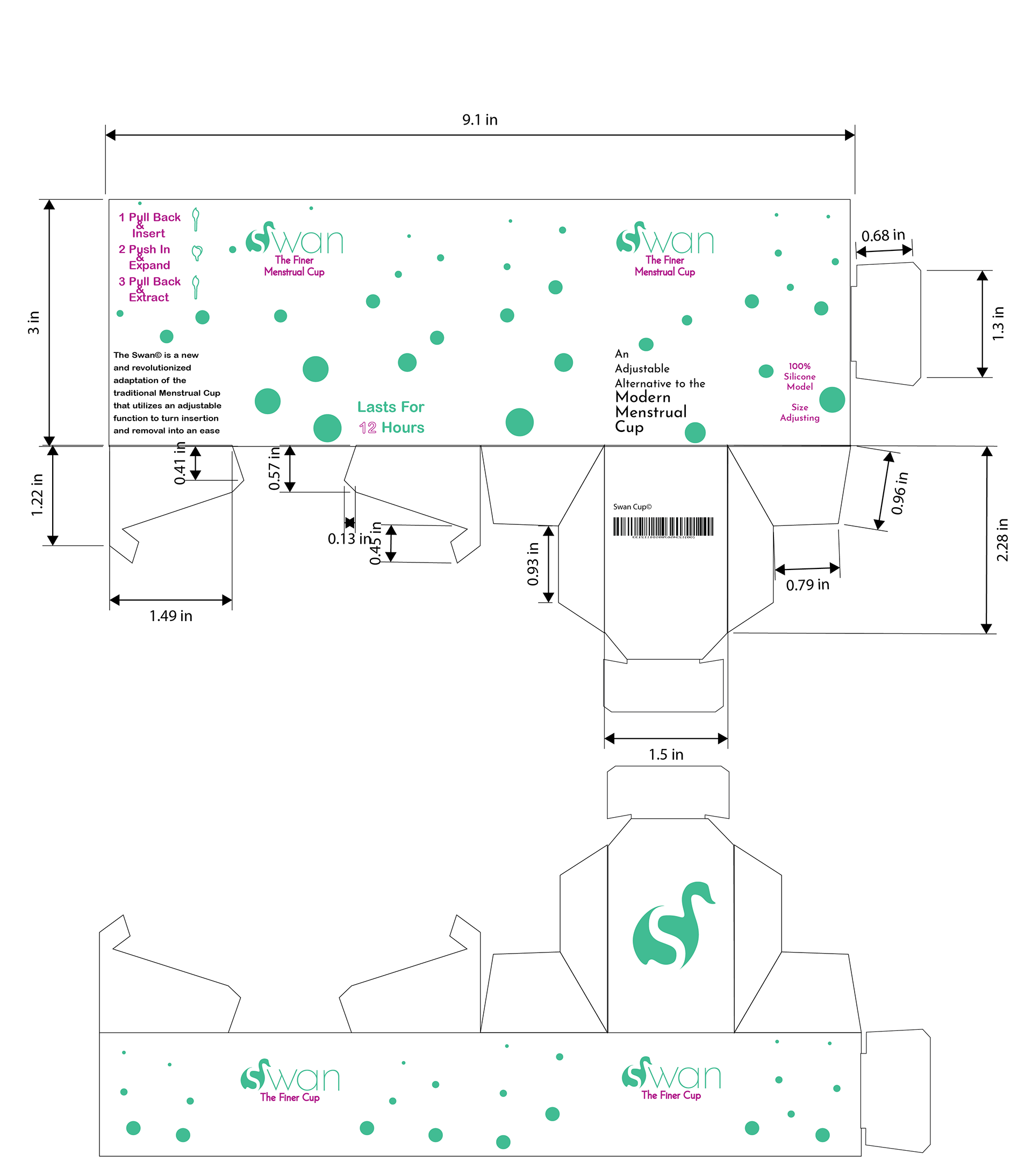
The Swan Product Package was made for a menstrual cup start up. The product was already developed and needed a rebrand and package design to go with it. This package design was made with the intention of making something innovative and simple, just like the product that goes with it.
The rebrand design was made thinking about how to depict femininity without making it dainty or erasing feminine identity of womanhood. This brought in the idea of using a swan; a graceful and beautiful creature as a symbol of strength that doesn't draw on strength as traditionally depicted.